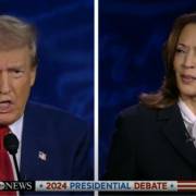
TV-Duell Kamala Harris gegen Donald J. Trump

🎤 TV debate between Donald Trump and Kamala Harris from 10.09.2024 🎤

Even though it was politically heated, there are exciting **rhetorical** lessons that we can use for our own presentations!
🚀   🔹 **Preparation pays off** Kamala Harris spent several days preparing intensively – and it paid off! 💡 Preparation is the key to success for any presentation or pitch, especially when it comes to important messages.

🔹 **Teamwork is key** Harris had a whole team of experts behind her. 👥 We often prepare presentations on our own – but it’s worth having someone else look over the content! That way you get valuable feedback.

🔹 **Free speech = more eye contact** Both candidates spoke without a cheat sheet, but only Kamala Harris really used the **eye contact** with the camera and the audience. 👀 Fewer notes and slides can make a presentation much more powerful.

🔹 **Gestures make all the difference** Both Trump and Harris used their hands purposefully, especially the right hand, to symbolically “hammer in stakes.” ✋💥 A powerful gesture can reinforce the message.

🔹 **Repetition as a stylistic device!** Kamala Harris deliberately used repetition, e.g. at minute 11:00: “Donald Trump left us…” 🔄 This technique, the anaphora, brings clarity and emphasis.   In conclusion: Harris completed her sentences – Trump often didn’t.

🧐 A clear structure ensures that the message gets through. 👉 To the YouTube video.

💬 **What rhetorical techniques will you use in your next presentation? Share it in the comments! 👇😊

——————–

If you also want to present more attractively, e.g. in a business environment, then let me support you. For example from me. I have been supporting my clients as a speaker, trainer and coach for presentations and pitches since 2002. Let’s talk: https://thomas-skipwith.com/kontakt/

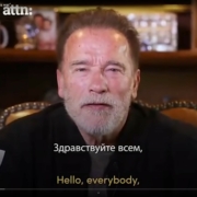
Arnold Schwarzenegger Russland Captatio Benevolencie

The Terminator shows his gentle side.

Hintergrund von Online-Meetings

What should the background look like online?

Wie viele Folien gehören in einen Pitch?

How many slides should you show in a presentation?

How many slides should you show in a presentation?


When will you give your next proposal presentation, your next pitch? Here’s a tip I highlight with my colleague Sandra Kuhn-Schulthess in the video below.

How many slides belong in a pitch?

See the video here.

Task:
1. watch the short video. It takes only 2:30 minutes.
2. consider if and how you can implement the tip.

If you need support, we are ready for you.


Conclusion: With very simple means you can make an impression on the audience and be remembered.

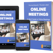
If you also see potential for improvement in yourself or others, I recommend the book “30 Minutes Online Meetings” by Thorsten Jekel and myself. Available in German and English.

I wish you the best of luck with your next presentation, whether online or in person.

Your

Thomas Skipwith

Online Meetings Englisch Cover

Put your words into action.

Armin Laschet Bewerbung 2021

Armin Laschet versus Friedrich Merz: This is where the speakers’ chaff is separated from the wheat.

Armin Laschet was elected chairman of the CDU Germany on January 16, 2021. He prevailed over his main rival Friedrich Merz. From a rhetorical point of view, I’m not surprised for a second. Why? You will find out in this article.

Armin Laschet’s speech was worlds better than that of Friedrich Merz. I suspect that Armin Laschet took a coach for this speech.

How do I compare the two speeches? I could easily list 20 points that struck me as positive in Laschet’s speech. At this point, only a few.

Armin Laschet Friedrich Merz


Really good: Armin Laschet makes a lot of eye contact with the audience behind the camera. Not ideal: Friedrich Merz often looks sideways at those present in the room instead of into the camera.
Both could speak even more freely if they had a teleprompter (or two) installed. That’s how Barak Obama has done it over and over again. Nevertheless, the point goes to Armin Laschet. Especially because he speaks the ending without reading.
He uses his father’s story in underground mining as an analogy for what really matters: Trust. Friedrich Merz needs practically no stories and no analogies. Therefore, no pictures arise in my head. But these would be important. The whole speech is too abstract, too general.
The camera settings are well chosen. In his place, I would have had a word with the picture director beforehand and certainly afterwards. The attitudes were consistently to his detriment: for example, several times we got to see bored party members or those who were doing something other than listening with interest.
Laschet cleverly put the recommendation to vote for him in the mouth of his father (14:08). Quoting Laschet, “He [der Vater] said, “Tell people they can trust you.” That goes down much better than, “Trust me.” He speaks in the “we” form, but I am not with him emotionally.
The conclusion is the highlight of the speech: Armin Laschet stands on the side of the lectern and pulls his father’s dog tag out of his pocket, creating an image for the ages. Moreover, he wonderfully closed the circle to the beginning of the speech. Friedrich Merz always shows himself more or less the same. It does not result in a special photo subject.

Conclusion: You should definitely watch Armin Lascht’s speech. And for comparison, a few minutes of that of Friedrich Merz. Finest visual material.

If you too want to give online and offline speeches that move your audience emotionally, give me a call. I will be happy to support you.

If you want more tips, you can subscribe to my YouTube channel. Of course, you may also share the post on social media. I would be happy.

I wish you success for your next presentation.

Thomas Skipwith

Start of a race as an analogy for the start of a presentation

When does a presentation start?

Start of a race as an analogy for the start of a presentationMany think a presentation starts with the first word. That is a good idea, but it is wrong. Above all, the presentation start is at the latest when attention is drawn to the speaker. Usually this is the point in time at which the speaker moves significantly. That means, as soon as the speaker gets up from his chair, all pairs of eyes are on him/her.

Recently I heard an interview by Brian Walter with Connie Podesta in the podcast “Voices of Experience” of the National Speakers Association NSA. Connie (www.conniepodesta.com) makes the point that the presentation starts much earlier. She is of the opinion that the presentation does not start on stage, but when the first contact with the potential customer takes place, that is to say many times on the phone.

What does she mean?

Before she even makes a phone call to the potential customer, she researches the customer. She is looking for a story with which she can create a good connection to the event organizer. She mentions two examples.

Example 1: Conny told the event organizer of McDonalds her personal story with McDonalds. She grew up in the same city where McDonalds opened its first store. Her father often surprised her and the family with a white bag of McDonalds. Even today she loves to go to McDonalds at the airport to drink a vanilla latte.

Example 2: When she phoned Walmart’s event organizer, she shared her father’s story. Example 2: When she phoned Walmart’s event organizer, she shared her father’s story. “My father has always been a Walmart fan and was always most happy to receive a Walmart voucher from me at Christmas. After he died, I found a valid voucher in my father’s jacket pocket. I thought a lot about what to buy with it. Finally I bought a picture frame from Walmart for a picture of me with my Dad. The picture and the frame are here in front of me on my desk.”

By the way, both times Connie was asked to tell the respective story during her key note performance.Thomas Skipwith is interviewed by Bruno Erni.

What can you take away from this for your own presentations?

  1. The presentation does not start on stage, but long before.
  2. The telephone conversation is like a short demo presentation. You show how well you understand the customer. The customer hears whether he feels comfortable with your style.
  3. You can use the story, if you are booked, for your appearance with the customer on stage.

Listen to the podcast here: www.thomas-skipwith.com/podcasts. (Bonus: You will here many more useful tips during the interview between Bruno Erni and myself.)

If you want to hear the original of Connie Podesta’s contribution in English, the best way is to download the Speakernomics app (formerly VoE) and listen to the April 2018 edition of “Voices of Experience”.

If you like this post, please share it on social media like Facebook, XING and Co.

Zwei Schwerter, die sich kreuzen als Analogie für die Frage, was besser ist: PowerPoint oder Prezi

PowerPoint or Prezi: Which is better?

I am often asked if I like PowerPoint or Prezi better. Unfortunately, there is no clear answer to this question. In a typical consultant manner I answer: “It depends.” It is not clear which software is better, because both have their advantages.

Is PowerPoint better?

PowerPoint or PreziPowerPoint is probably known to all readers of this training newsletter. Who presents without PowerPoint? Nevertheless, it is worthwhile to think about what PowerPoint is all about.

  • The software follows the same logic as the other Microsoft programs Word and Excel. Many people find it correspondingly easy to operate.
  • You write and draw page by page (slide by slide) – similar to a book.
  • It is the de facto standard in the business world. Virtually all laptops have the software installed and you will have little trouble with it at conferences.
  • The software is installed locally on the laptop/computer. You don’t need an internet connection to hold your presentation (unlike Prezi).
  • PowerPoint for Windows goes well with most projectors. (The PowerPoint version for Mac should be used with caution. Also, the Mac version has less features.)
  • https://products.office.com/de-ch/powerpoint

Or is Prezi better?

PowerPoint or PreziPrezi’s logic follows a different pattern. It was developed by architect Adam Somlia-Fischer, who wanted to show his audience both an overview and details on a map – without losing the overview. Following this logic, you will not find individual pages in Prezi as in PowerPoint, but a single, infinitely large area. You can zoom in and out on it. This way you can see the overview and details on a map as you like – similar to zooming in and out on Google Maps.

  • Prezi is designed as a cloud-based application so that it can be accessed from anywhere and the files can be easily shared. Accordingly, a functioning internet connection is required. (However, there is a downloadable version for an additional charge. This can alleviate problems in hotels with poor internet connections.)
  • It is ideal for explaining a city map to tourists or presenting a floor plan of a production line, for example.
  • Prezi fulfills the criterion to do something different than everyone else. In this respect it can be a good change and thus increase the attention of the audience.
  • If all other speakers use PowerPoint at a conference and you present with Prezi, you will have to overcome additional technical hurdles.
  • It is difficult to produce participant documents. Usually it means an extra effort.
  • If you use Prezi badly, you can cause nausea among your audience. (In the past I already had the feeling that I was on a roller coaster.)
  • The software needs (like any software) a more or less long training period.
  • https://prezi.com

Conclusion

What can you take with you for your own presentations?

  1. Both are good tools. It is crucial that they are used correctly, though.
  2. So it is not a question of “either-or”, but of which tool better serves your purpose.
  3. Use either tool correctly – and it has a great impact.

If you like the post, why not share it in the social media such as Facebook, XING and Co.?